Assignment #1 Icons
Objective: In this assignment, simple icons had to be created with illustrator. However, we could only use the shape tool to create them. If the icons were too busy, then something had to be removed.
Reflection: Looking back at this assignment, it was somewhat difficult to visualize the real life items in the form of an icon. Using only the shape tool was also somewhat hindering the process, but I believe that the icons turned out to be pretty good.
The Objective of this project was to incorporate different elements of design into nine different visuals. Looking back, I see that elements of design are very important when creating different designs.
The objective of this assignment was to create a color wheel using two objects in direct relation. Looking back, I see that the color wheel is very important and helping when looking for a color scheme.
The objective of this was to create 4 different portraits using 4 different color schemes. Color schemes can really add things to artwork.

The objective of this assignment was to create a mosaic using images that related to the picture.

The objective of this assignment was to imitate the artwork of Stephen Croninger's book If I Crossed the Road. Looking back, some of the image sizes could have been changed to benefit the piece.
For this assignment, we were to find a picture of a group of people and Photoshop ourselves into it. Looking back, the light in which you took the picture really matters.
For this assignment, we were to find a picture, word, and matching font and recreate the picture using only the words. The picture had to include shading and variations of the word or letters that compose the word. Looking back, I should have really covered all those ugly white spots.
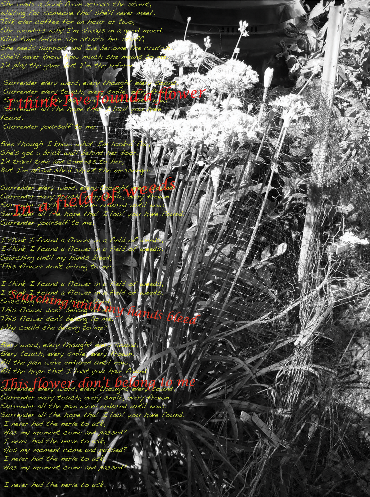
Looking back at this assignment, the hardest part was probably finding and image that properly conveyed the feelings that are felt when hearing the song (the lyrics anyway.) The colors could have been worked upon, but they work well together.
For this assignment, we were supposed to mimic an illuminated manuscript. I took lyrics from a song that I like (Pendulum) and used them as the text that would normally inhabit the paper. The design around the text was done with several custom pen designs gathered on the internet. The designs were supposed to border the text in a way that did not distract the reader, but rather keep their attention. I like the color combinations and the variation of the light and dark colors to show what is close and what is far. However, looking back at the design at the bottom of the page, there is a lot of empty space that could have been easily fixed/filled with the use of another design or simply scooting something over a smidgeon south. Shame

For this assignment, we had to create a business card for a logo that we had already created (top left.) The information for the card was vague and did not disclose any information of course. I really like the colors pink and yellow when working together in this artwork. These colors were used to give the art a more childish feel to the card because children are the prime targets for candy stores. Right?

For this assignment, we took all of the information gathered from the podcasts and put them into some kind of informational board. I chose to do a chalkboard because it seemed fitting seeing as this was kind of a lesson on the history of visual communication. I used the pen tool to manually draw all of the artwork to give it a feel that actually makes it look like it was put on a chalkboard in some classroom. The art did not turn out as well as it could have (given that it is very difficult to freeform draw with the pentool) but otherwise, the artwork flows well with the lines as a sort of guide. This also kind of reminds me of a map. That's pretty cool I guess.

For this assignment, I had to create a poster addressing a social issue that affects the world in some way. I chose extinction in animals because I personally love animals. Looking back at this assignment, the lines on the outside of the wolf are not rounded off well and does not help with the flow of the artwork. It looks a little choppy. Otherwise, I actually like this.
This is also part of assignment 20. The idea is a little bit overdone (both the use of the panda and some kind of animal standing on top of the world) but I think that this turned out nicely. Some of the earth's smaller details (including the Dominican Republic) were left out of this artwork. The smaller details seemed unnecessary to the artwork so they were cut. Some of the continents were out of proportion because this earth was supposed to show the earth as if it were viewed form space and not a map. The fact that the earth is a sphere changes how it looks and how large the continents appear.